 On the GJ Book Club, we're looking at Chapter 12: "Rhythm, Variety of Line" Harold Speed's 1917 classic The Practice and Science of Drawing. The following numbered paragraphs cite key points in boldface, followed by a brief remark of my own. If you would like to respond to a specific point, please precede your comment by the corresponding number.
At Roberto's suggestion, we're dividing this gigantic chapter into two.
1. When groups of lines in a picture occur parallel to each other they produce an accentuation of the particular quality the line may contain.
Speed uses the parallel outstretched arms in the William Blake as an example (lower right). Building the metaphor on Walter Pater's suggestion that "painting aspires to the condition of music," Speed talks about such parallelism being like a chord in music.
Personally, I believe the metaphor of design = music begins to break down when you start talking about chords vs. staccato (I think he actually means arpeggio, actually. Musically speaking, staccato is the opposite of legato.)
2. All objects with which one associates the look of strength will be found to have straight lines in their composition....These lines possess other qualities, due to their maximum amount of unity, that give them great power in a composition; and where the expression of sublimity or any of the deeper and more profound sentiments are in evidence, they are often to be found.
For these points he brings in architectural examples, discussing the severe and dignified vertical columns of the Greek cathedrals.
3. The horizontal and the vertical are two very important lines, the horizontal being associated with calm and contemplation and the vertical with a feeling of elevation.
He continues, "their relation to the sides of the composition to which they are parallel in rectangular pictures is of great importance in uniting the subject to its bounding lines and giving it a well-knit look, conveying a feeling of great stability to a picture."
I think these points are pretty familiar to most readers here, so I'm not going to make too much of them.

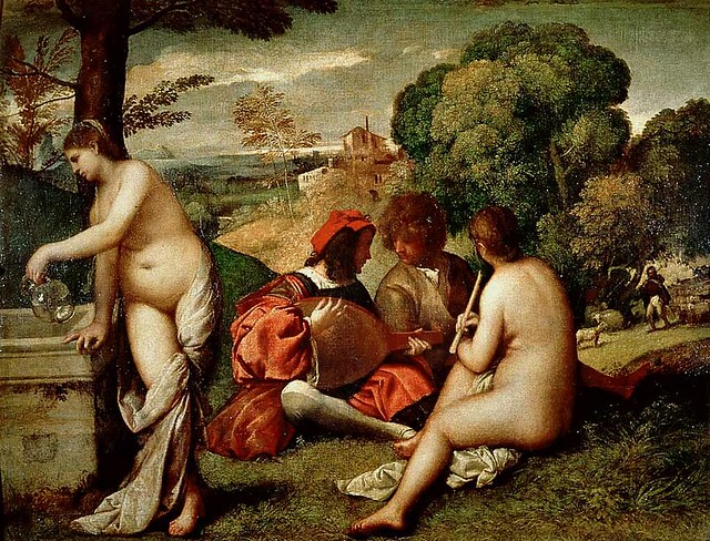
4. Giorgioni's Fête Champêtre.
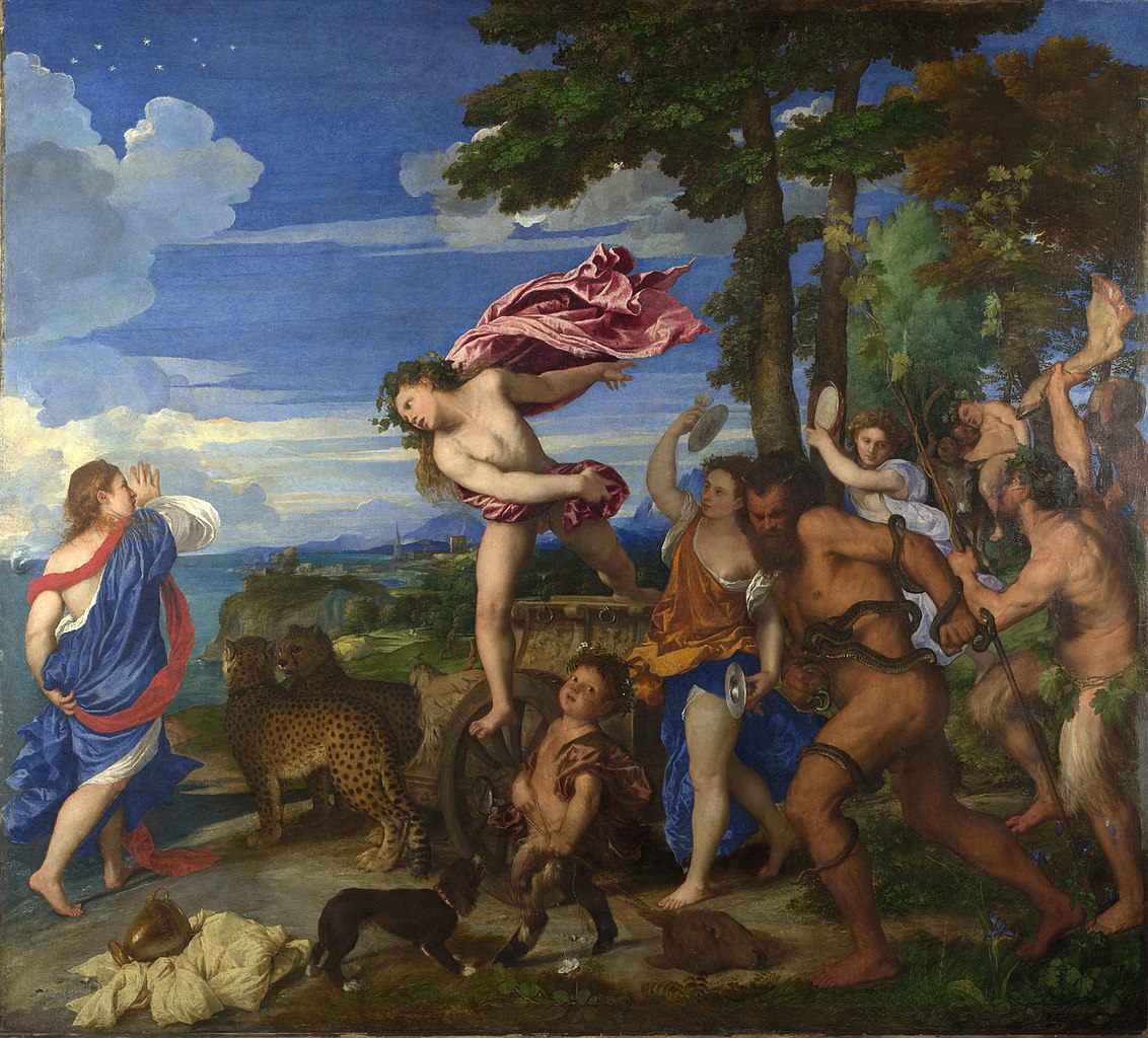
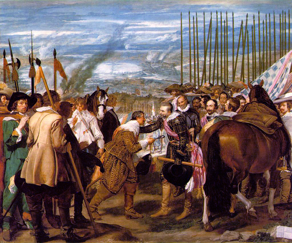
Speed uses a couple of old master paintings to illustrate his points, so I'll just add them here in color.
6. G. F. Watts, Love and Death
It's worth noting that Watts did several versions of this composition. There's another one here that doesn't have the flowers strewn across the steps.
7. Diego Velazquez, Surrender at Breda
8. The combination of the vertical with the horizontal produces one of the strongest and most arresting 156chords that you can make.
Speed continues: "and it will be found to exist in most pictures and drawings where there is the expression of dramatic power. The [Christian] cross is the typical example of this. It is a combination of lines that instantly rivets the attention, and has probably a more powerful effect upon the mind—quite apart from anything symbolised by it—than any other simple combinations that could have been devised."
9. Other lines that possess a direct relation to a rectangular shape are the diagonals.
Speed identifies parallel diagonals and alignments in the Velazquez.
10. Superimposed structures
Here's my thought about all these Old Master examples. We may never know whether Titian or Velazquez or Giorgioni consciously used such devices in their compositions. At least I'm not aware of any of their writings that address the effects that they may have intended by their use of horizontals, verticals, rhythm or unity. So I'm just a little bit skeptical about the kind of post-facto analysis that Speed is doing here. We've all sat through art history lectures that show fanciful invisible hidden structures in old master paintings. I even endured one lecture where the presenter turned paintings upside down and discovered sinister faces hidden in the branches of the trees!
Without knowing what the artist thought, you never really know whether the structure exists solely in the mind of the analyst or truly in the artist who created the picture.
So I thought I'd finish up this post showing some examples of artists after Speed's time who were conscious of these devices, because they wrote about them.

Norman Rockwell using diagonals to convey action. In Rockwell on Rockwell: How I Make a Picture
Andrew Loomis uses verticals to suggest dignity and reverence. He also talks about verticals and diagonals in Creative Illustration
We'll continue with part 2 of the chapter, about curved lines, in next Friday's post.
-----
The Practice and Science of Drawing is available in various formats:
1. Inexpensive softcover edition from Dover, (by far the majority of you are reading it in this format)
3. Free online Archive.org edition.
Articles on Harold Speed in the Studio Magazine The Studio, Volume 15, "The Work of Harold Speed" by A. L. Baldry. (XV. No. 69. — December, 1898.) page 151.
and The Windsor Magazine, Volume 25, "The Art of Mr. Harold Speed" by Austin Chester, page 335. (thanks, अर्जुन)
GJ Book Club on Pinterest (Thanks, Carolyn Kasper)
New GJ Facebook page, credit Jenna Berry
Original blog post Announcing the GJ Book Club


2 comments:
An interesting aspect of unity of line in rhythm, that I have not seen written about, is the repeating of reciprocal angles throughout the design of a painting.
I was preparing some compositional workshops a few years ago and started noticing this in a number of paintings by artists like Jean-Léon Gérôme and Velázquez. I have seen this in more contempoary artists like Stapelton Kearns.
Whether conscious or unconscious it is fascinating.
Have you seen or read anything regarding this?
Thanks for breaking-up this chapter, James. There is a lot to cover in this tome-of-a-chapter. I’m not very impressed by Blake’s ‘Job’ paintings, but I guess they make his points. Your substitution of the color versions of the Titian, and the Velazquez, etc., is quite helpful too.
I’m a little unclear about Glen’s reference to ‘repeating of reciprocal angles,’ (perhaps he could post a link to an example or two). In Giorgioni's ‘Fête Champêtre’, Speed points out the straight line created by the central figure’s bent legs and her flute, and I can't help but notice the leg of the lute player creates two rather jarring 90* (degree) angles.
Point 8. A rather obvious and blatant example of this is found in Mondrian’s compositions (low hanging fruit, I know):
https://sp.yimg.com/ib/th?id=JN.0s0N0dujWIKpAzVfBRCo9w&pid=15.1&P=0
and from the other end of the continuum, here’s another blatant example (Mickey B’s Ceiling):
http://everydaydreamholiday.com/wp-content/uploads/2012/12/sistine-chapel-ceiling_rome_vatican_city.jpg
One of the really fun aspects of designing murals is the ability to incorporate architectural elements (doors, windows, crown moldings, etc.) into the composition in order to take advantage of these principles, or to create such elements in trompe l’oeil, (as Buonoroto has done in the above example.)
Point 3) It can also be quite challenging and fun to take into consideration the sometimes irregular or oddly shaped surfaces found in the architecture (such as spandrels, niches, lunettes, and pendentives).
Moving along to the ‘middle ground’, here is an example of point 8 from Andrew Wyeth:
http://flann4.files.wordpress.com/2008/06/zhaokailin1.jpg
oh, and one from this guy:
http://2.bp.blogspot.com/-5m3Tbz3qZcs/VXgWP1U4yqI/AAAAAAAAbco/3SC8XFgIbF0/s1600/11400986_10206991312885496_5028303466932239070_n.jpg
I had been contemplating Susan Sorger’s query about your composition, and it’s interesting to try and figure out why some comps work in one situation, and not in another. I like to play around and push the limits of my compositions, and I have found that, (in addition to producing some questionable paintings) one can be very aggressive in ‘breaking’ compositional ‘rules’ if the offense is counter-balanced by an other stronger principle, or two. The vertical and horizontal lines not only overcome the ‘dissonance’ of the central beam cutting through the painting, (and the value of the beam being quite close to the value of the sky also helps) but the ‘window’ they create frames the shaded area w the yellow shirt and the bright trees in the background, echoing, or playing against, the open space on the right. Most of the time these things are quite intuitive, and I am sure you didn’t set out to intentionally do this, but what fun it is to explore perception! Very nice job, Jimi Gi -RQ
Post a Comment